TOOLS & WORKFLOWS
From a plain white page to a game lobby: how a 2001 game's look got me to open my ADHD to-do app
Published:
I built Calendar for Real ADHD for my own ADHD: one page, one LOG button, cards coloured by how close they are. It worked. It also looked like a sketch, in an Excalidraw or Canva style: white page, black outlines, a bit of red. Useful, and easy to avoid.
So I asked Ada, the AI chief of staff I run in Claude Code, to give it the look of Survival Project, a 2001 Korean online game whose visual design I love. Now the same cards sit in a sunny game lobby. The change from that plain style to this visual one is the part I want to share, because it really helped me engage.
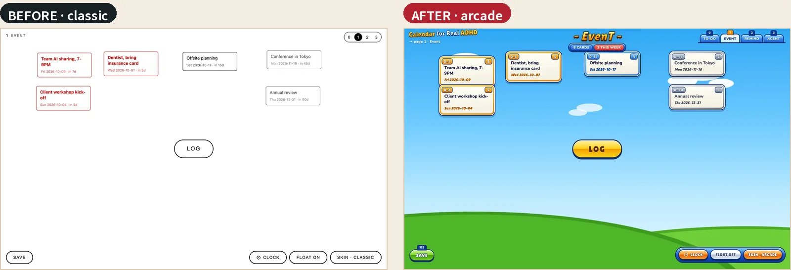
Before: a sketch on a white page
The original look is deliberately quiet. Every card is a thin outlined box with its text and date. Cards turn red when the date is close, and that is the main signal on the page. It reads like a whiteboard drawing: clear, calm and easy to ignore.
For my brain, that is the catch. A page that is easy to ignore is a page I put off opening, and a to-do canvas I do not open does nothing.
After: a game lobby
The arcade skin keeps every card and every button. What changes is the surface. A blue sky and green hills behind the page. A gold room title, "~ EvenT ~", with a strip that reads "6 CARDS · 3 THIS WEEK". A glossy yellow LOG button. Cards framed like game cards: gold for this week, blue for this month, silver for later, a red glow for anything overdue, with a countdown plate (D-3, TODAY, 2D LATE) and a rank tile (SS, S, A, B). The dialog turns into the game's blue chat panel.
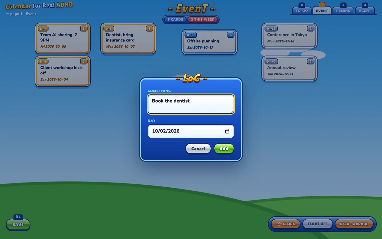
Why the game look helps me engage
I have no number for this, only my own experience. The lobby look makes the canvas feel like somewhere I want to be. I open it, I see which card is glowing, and I do something about it, instead of avoiding the page.
Two details matter most to me. The urgent card does not just turn red; it glows and carries the highest rank, so I see it first. And the page feels like play, and play is how I get started on things.
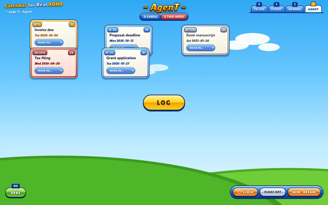
How Ada got from one look to the other
The method fits on one screen, and it works for any redesign, not only games:
- Research the reference. Survival Project (서바이벌 프로젝트) was developed by I.O. Entertainment and published by HanbitSoft. Closed beta began in November 2001, it launched on 17 February 2003, and the Korean servers closed in February 2013.
- Read real screenshots. Ada studied three screens from a review gallery on MMOHuts: the lobby, a room with character select, and card select. They are someone else's screenshots, so I link to them instead of reproducing them.
- Write the design grammar down. Sky and grass behind every screen; gold outlined titles with the last letter capitalised ("~ LobbY ~"); glossy capsule buttons on blue trays with small key plates; tabs along the top; cards with a number plate, an S or SS grade and a level plate; colour coding by element; a blue chat panel.
- Map each piece to a job in my app. That is the table below.
- Build it in CSS, then screenshot every page. No game artwork is used.
| In the game | In my canvas |
|---|---|
| Room title, "~ 11th RooM ~" | Page title, "~ EvenT ~" |
| Glossy capsule buttons on a blue tray | LOG as the yellow READY button; SAVE with a ⌘S plate; CLOCK and FLOAT on a blue tray |
| ME / GAME / GUILD / FRIENDS tabs | TO-DO / EVENT / REMIND / AGENT tabs with 0 to 3 key plates |
| Element colours on cards | Urgency frames: red glow for today or overdue, gold this week, blue this month, silver later, pink for to-dos |
| Number plate and S/SS grade | Countdown plate and rank tile |
| Blue chat panel | Dialogs titled "~ LoG ~" |
The screenshot check paid off. It found a bug that was there before the new look: the code that keeps cards off the buttons only ever avoided LOG. It filtered elements by offsetParent, and buttons with position: fixed have none, so cards could land on SAVE, CLOCK or the tabs. Ada switched the test to getClientRects().
Make it yours: skins
When I saw the result, I did not want to force my taste on everyone who uses the app. So Ada turned the look into a skin system, now on the public main branch (commit 48731a4):
- Each look is one CSS file in
skins/.classic, the original white page, stays the default.arcadeis the game look. - A SKIN button cycles through them, and the app remembers your choice.
- The single-file standalone version includes every skin.
Making your own takes two steps, from the skins README:
- Copy
classic.csstoskins/<name>.css. - Add one line to the
<head>ofindex.html, under the others:
<link rel="stylesheet" href="skins/<name>.css" data-skin="<name>" data-label="Your Name">
Reload and press SKIN until yours shows. Keep cards about the same width so saved layouts still fit, keep text readable at a glance, and use no external images.
One more change came with it: cards can now overlap. Drag a card onto another and whichever one you touch comes to the front. New cards still place themselves apart, and cards are still kept off the buttons.
The brief, ready to copy
Swap the brackets for your own app and reference. It works as one message to any coding agent that can read your code and take screenshots.
GOAL: Give [my app] a new look inspired by [game / product / era].
Do not change what the app does.

RESEARCH FIRST: Who made [reference], when, and which screens
define its look. Cite sources.

GRAMMAR: Study [3] real screenshots of [reference]. List the design
rules: backdrop, titles, buttons, tabs, cards, colour coding, panels.

MAPPING: Map each rule to a job in my app, as a table:
[reference element] -> [my element]. Say what you will not use.

BUILD: CSS only, as a separate skin file. The current look stays
the default. No artwork or images from [reference].

QA: Screenshot every page and dialog. Report what looks wrong,
including bugs that were there before the new look.
FAQ
Can a playful design help with ADHD?
For me, yes, though I have no measurement, only my own use. The game-lobby look makes me want to open my to-do canvas and act on the glowing card, where the plain white version was easy to put off. Try a skin and see whether it changes how often you open the page.
Can an AI agent redesign an app's UI from a game screenshot?
Yes, if you give it a method rather than a picture. My agent researched the game, studied three real screenshots, wrote the design rules down, mapped each one to a part of my app and built it in CSS. Then it took screenshots of every page to check the result.
Is it legal to copy a game's UI?
I did not copy it. No artwork, images or files from the game are used; the skin is written from scratch in CSS, after a written list of design ideas such as gold titles, capsule buttons and colour-coded cards. The reference screenshots are linked, not republished.
What is Calendar for Real ADHD?
An open-source to-do canvas I built for my own ADHD: one page, one LOG button, cards coloured by how close they are, which drift gently instead of stacking in a list. It runs locally and is MIT-licensed on GitHub.
How do I make my own skin?
Copy skins/classic.css to a new file in skins/, add one <link> line to the <head> of index.html, reload and press SKIN. The skins README lists everything you can style.